Kansept's Own

illustrative branding

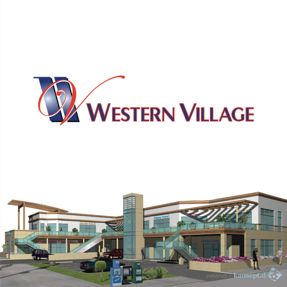
The illustrative

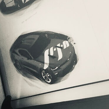
Brand recognition of a prominent franchise. Simplified vectorization of a photo memorandum.

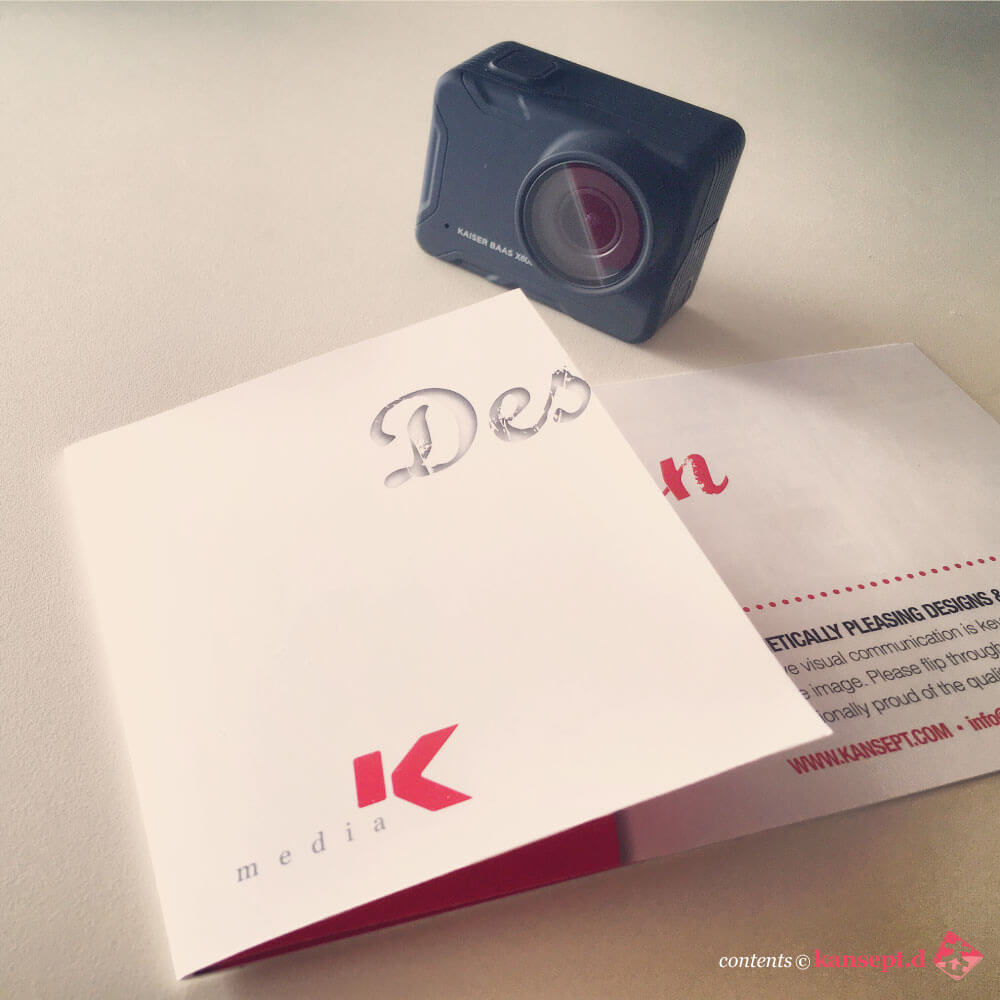
brochures camerize

Tangibles

Print design for efficiency. One single flat with interchangeable layouts to produce one unit.

illustrative logo design

Identity

Representation of material and process. Organic versus manufactured integration.

flower in the spring

Photoration

Colour so beautiful. Unexpected bloom of terrace in the spring.

corporate identity

Branding

Concept of Cultural Mingle portrayed by amalgamation of geometric and organic shapes.

font variation studies

Typeface

Font is a visual variation and its stylization exploring the language and writing derived.

graphic signage

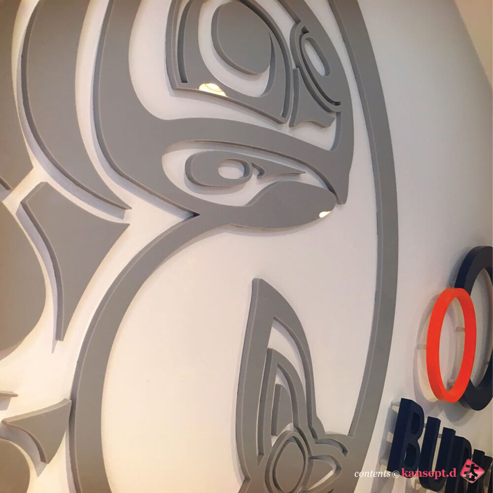
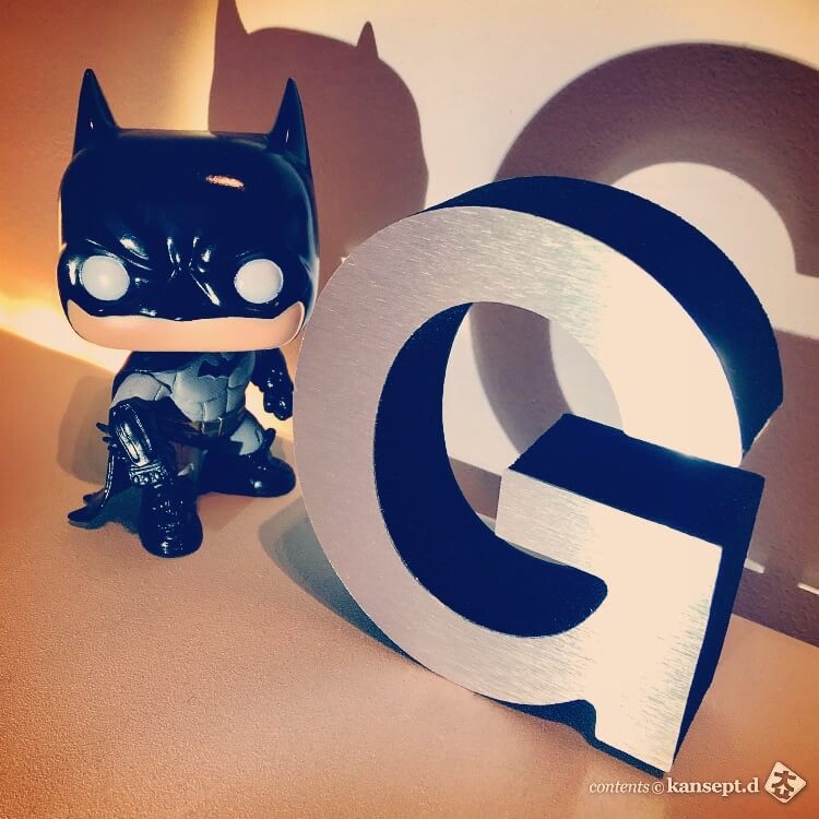
Gemini

From vectoraization to acrylic’s finest piece of representations and their applications.

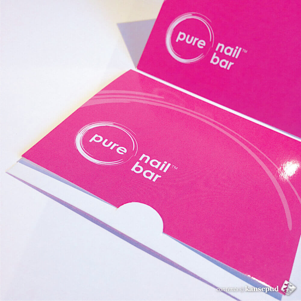
Design Gift

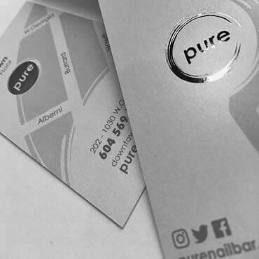
Pure Gift

Colourful endeavour, preciseness of stomp at its best value. Gift card cover to present.

Canadiana

Rockies

Linear arrangement in free, calculated by none other than nature.

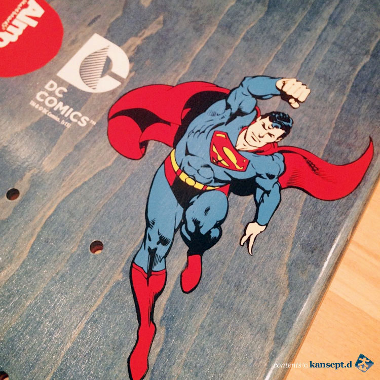
Superman

Super

Never know what’s underneath. Once the grips been applied, reveal is arrival of the new. “철저한 가림속”

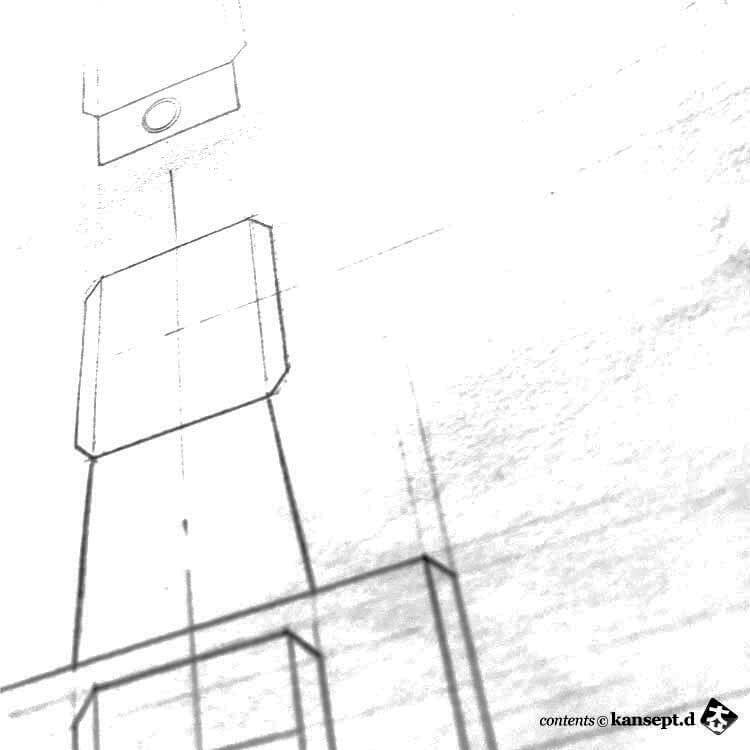
Traditional Drafting and Engineerings

Traditional

Robotics in the realm of grid, a derivative we celebrate as lines fit smooth.

Gemini Letter Design

Represent

Aluminium etched foam letterings. Interior & exterior accentuations for the big B to hang & chill.

1 | 2

Kansept
Kansept
Kansept Design
Kansept Industrial Design
Sound Design
Sound Design

Concept

is fluid. a progressive motion where there’s no end . an abstract idea or notion that is conceived in the minds. realized in the lab.

About
Guarantee
Creative Process
Shipping & Handling
Sitemap